 portfolio v2 homepage
I've always loved letting my secret artistic side work its magic. Sketching in pen and ink, browsing Dribbble, or even pondering philosophical questions (the art of logic!) — these have long been my way of finding peace. This summer, I decided to bring those passions together and create something artistic that also showcases my thoughts. And so, after a few months of grinding, this site was born.
The perfectionist in me didn't make the process easy. I spent nearly a month searching for inspiration, waiting for that spark. Looking back, I should've just started coding. Inspiration often comes once your hands are already moving. For me, some of my best ideas that eventually went into this version of the website came around 2 months after I started building a portfolio. The very first version of this site was stitched together with vanilla HTML, CSS, JS, and a little jQuery — by the end of June 2024, I had a my website's first version ready. If you are interested in taking a look, it is still hosted here. Source code is available on my Github). I have also attached some screenshots of the websites below.
 portfolio v1 about section
 portfolio v1 navigation menu
 portfolio v1 experience section
At first, I pieced the site together like a mosaic — stuffing in components from places like CodePen, Uiverse, and Loadmo.re. It worked, but the result lacked unity. If you click into my old website, you will find many animations feeling very out of place. Most animations are there for no reasons, and none of them make sense with each other on the page. However, after spending days and nights working on it, what I did gain was a good understanding of how complex animations were created using Javascript and CSS. It felt quite like editing videos in Adobe After Effects, which I had some experience with in the past, so I wasn't a complete stranger to animation concepts like keyframes, easing, and motion paths.
Then came my internship at KiDrone. Between tasks, I revisited my site from time to time and felt a wave of creator's remorse. I wanted something cleaner, something better, something that would challenge my technicals further. However, the internship kept me busy, so I didn't have time to dive deep into it again until the internship ends. With a month left before school started, I decided to rebuild from scratch, partially because there were too many code duplicates with vanilla HTML, CSS, and JS, and partially because I wanted to re-plan the website thoroughly from scratch to align the style. This time, I sketched out wireframes, and applied the lessons I had picked up from a design firm during my internship: interactive icons, annotated functions, and routing flows. I didn't want to use Figma because I wanted to build quicker and not let the ideas in my head wander away.
Below are the sketches I did for the 2nd version of my website. I am not the best artist, but the limited artistic cells in me is enough to establish the basic layout and style of the website. If you look closely, you will probably notice that some elements did end up on the website, and some didn't. These decisions were made on the fly as I coded.
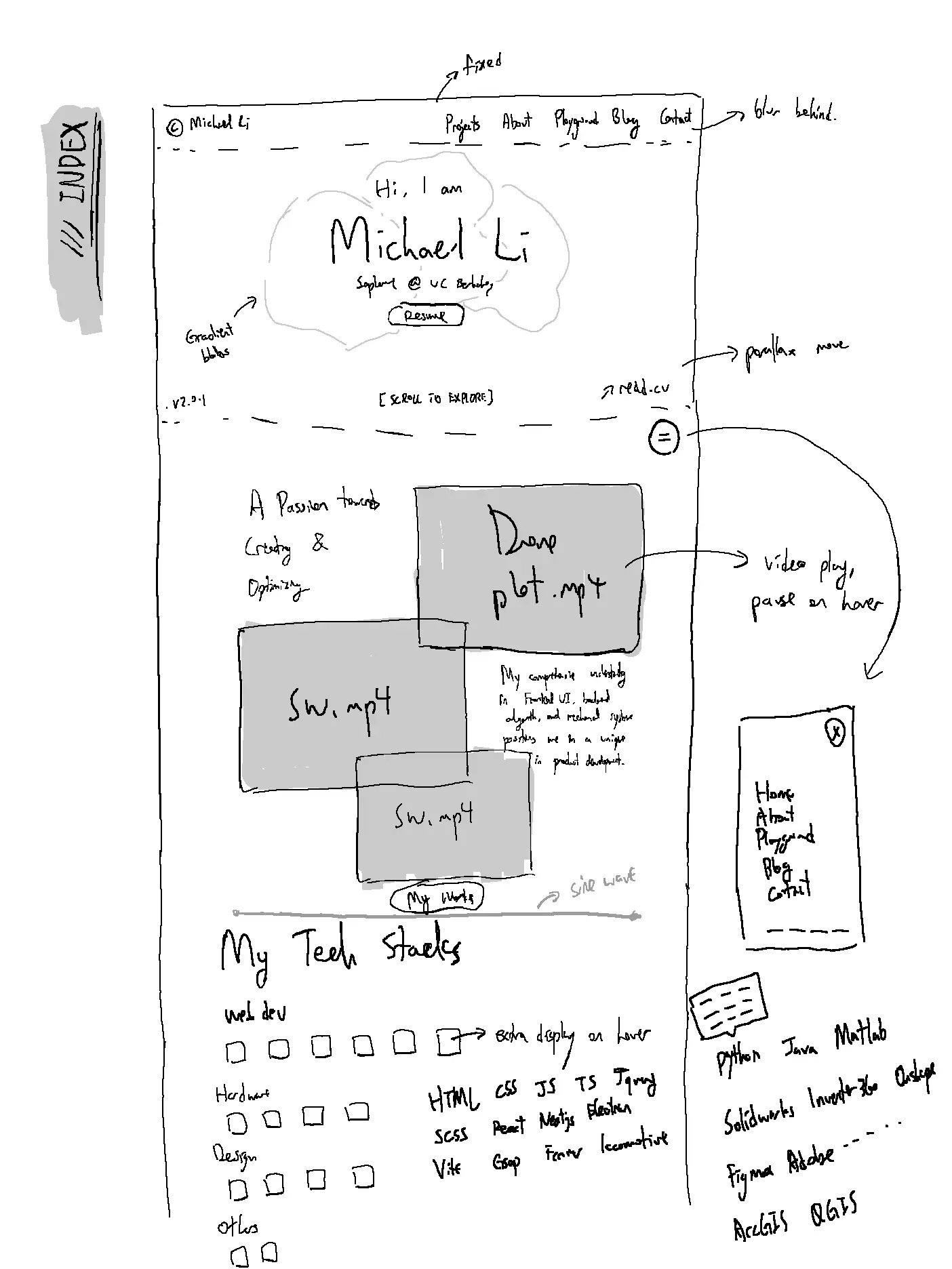
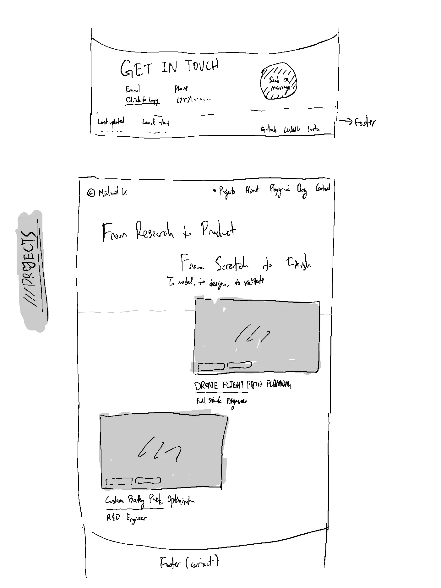
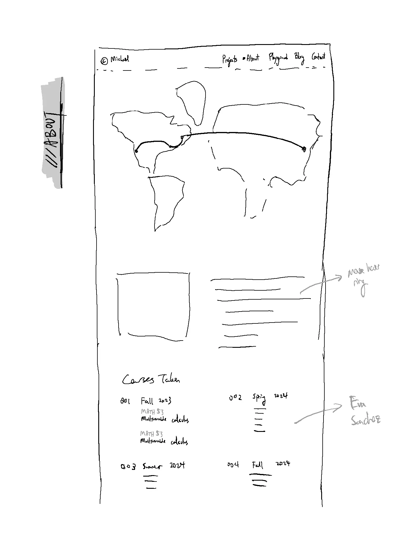
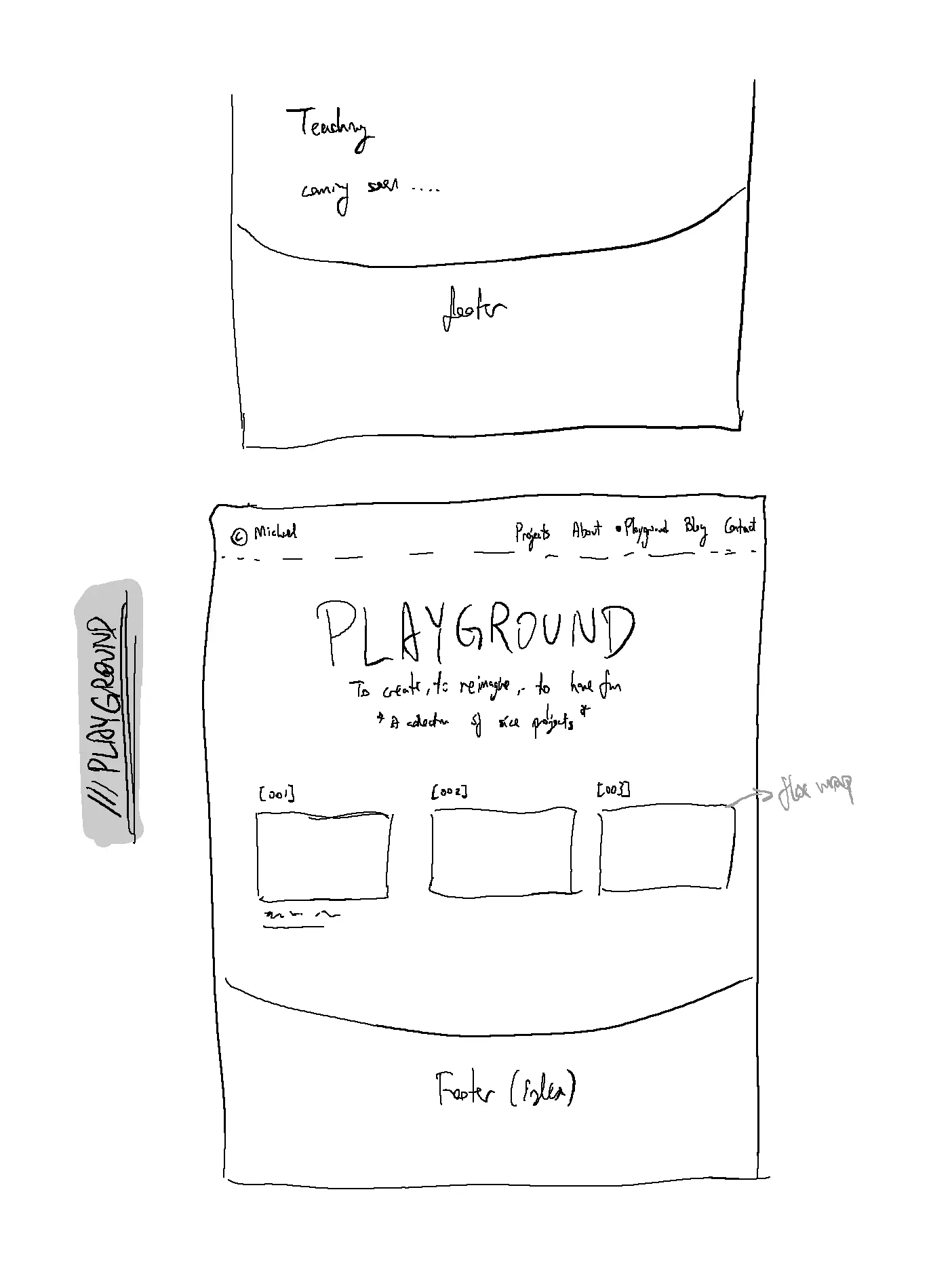
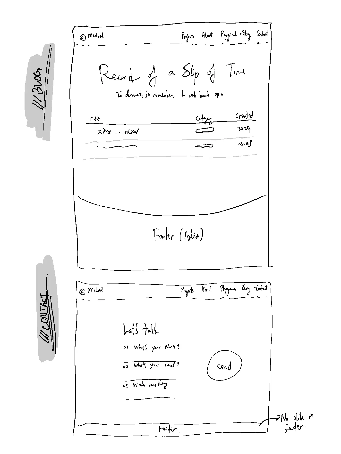
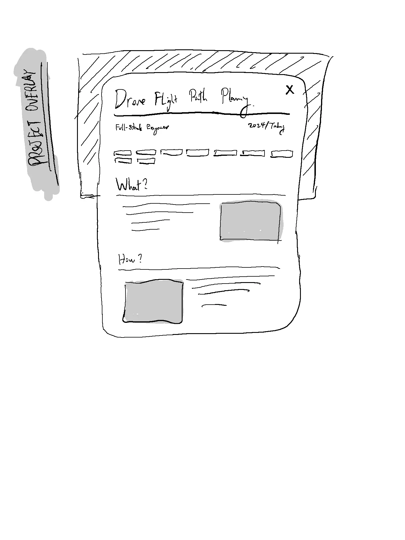
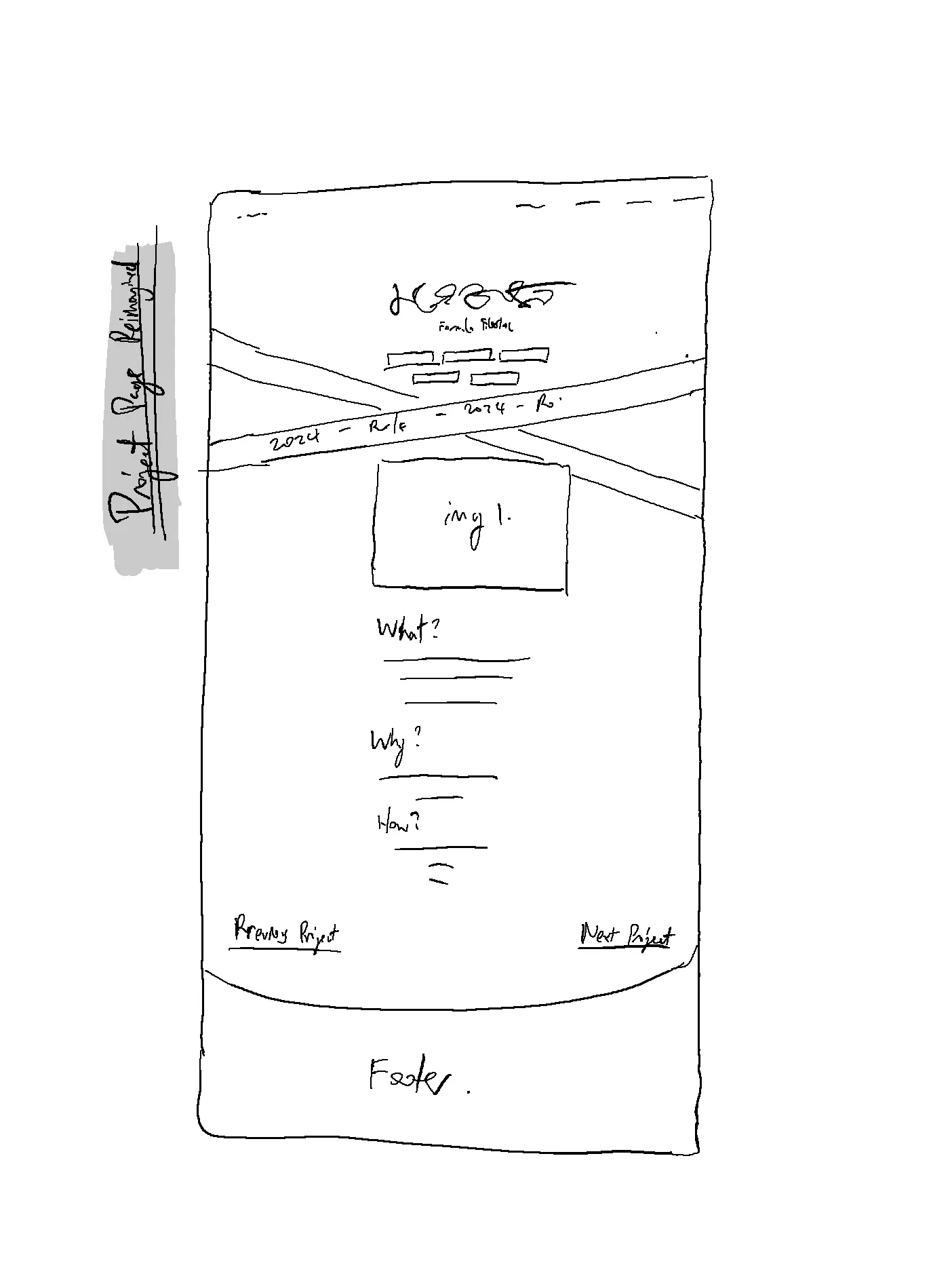
 sketches of the v2 portfolio design
With a clearer design, I turned to frameworks. I considered React, Vite, even vanilla JS again. I started with React, but as a beginner, I found it not so easy to setup, specifically page routing. Eventually, I settled on Next.js because its routing felt beginner-friendly. I later discovered Olivier Larose and Tom Is Loading, both of whom inspired much of the animation work I ended up creating. For motion, I leaned heavily on Framer Motion (now Motion) and occasionally on GSAP. I personallyenjoy Framer Motion a lot more because it aligned with after effects fundamentals a lot more, and felt a lot more intuitive.
I also spent quite a bit of time searching for the right aesthetic. I wanted something organic and flowing. Those tutorial demonstration websites are the specific style I tried to avoid. So I browsed through different sites for inspriation pretty much at any time I have my phone with me. Some sites that proved to be invaluable were: Awwwards, Godly, SiteInspire, A Fresh, and Landing Love. There was also Coolors for color palettes.
One thing that got me stuck for a while was the background image for my landing page. As I was looking for one, I was looking for something playful. I tried modeling some backgrounds in Spline and exporting the video to a gif, but quality and performance issues quickly surfaced. Then, on a whim, I asked ChatGPT to generate one. That was back in the day when DALL-E was somewhat popular but ChatGPT wasn't so reliable at generating great codes. To my surprise, after a few iterations, it delivered beautiful, license-free images (yes, AI art is license free). That became the backdrop of this site.
 Dalle generated abstract art
The final stretch was a whirlwind. To learn Next.js, Framer Motion, GSAP, and Locomotive Scroll, I squeezed in every hour I could before school. Hours were poured into compiling errors and fixing bugs, and hours were spent on trying to make the website look and feel just right.
Of course, there were frustrations (quite a lot to be frank): exit animations not supported in the Next.js app router (forcing me to migrate back to the page router), Locomotive Scroll breaking fixed positions because it uses transformation in the background, hours wasted on a cache bug, and occasional page blank out due to SCSS unmounting before HTML. If only AI coding tools were more useful back then, it would have saved me a lot of time. However, looking back, I still enjoyed the process of debugging and learning myself without AI directly giving me the answer.
There were also victories: building a smooth animation without tutorials, implementing a CMS that worked perfectly, publishing the site to a live URL, and watching it flex seamlessly from phone to tablet to an ultra-wide monitor. Months after I first hosted the site, I am still proud of myself for creating all the smooth animations across the site.
Looking back, I can say this journey — from knowing nothing about HTML to building this site in just three months — has been both humbling and exhilarating. I not only built my website, but I also learned the fundamentals of web development - why some tools exist and are necessary, and what are the backbone architecture of a website on the internet. If you want to make a site for yourself, my one advice is: never get stuck in the tutorial hell. Just start coding, and look for answers when problems arise. You'll walk much quicker this way.
And if you need more tools along the way, here are a few that you will probably find useful: Easing functions, color utilities, and for inspiration, the following are some of my favorites.
Seyit Yilmaz, Dennis Snellenberg, Eva Sanchez, Stan Bondar, and Better Off Studio. These are all works from some top notch designers or studios in the world, so don't be daunted by them. You should take inspiration from their design and see how you can use them yourself.
Overall, it has been an amazing and rewarding journey. If you're considering building your own portfolio, stop thinking and start doing. It's easier than it looks, and it only gets easier the more you immerse yourself. I do not plan on releasing the source code to my website since I don't want people commercializing it, but if you want to learn how I build some specific components on my site, feel free to send me a message — I'd be glad to help.

